Discover an Easy Way to Create Complex Animations with MotionLayout
written by:

X min read
13.1.2021

MotionLayout: Basics
So, what’s the MotionLayout? Simply put, MotionLayout is a Viewgroup that extends ConstraintLayout.
We can define and constraint children just like we would do when using standard ConstraintLayout. The difference is that MotionLayout builds upon its capabilities - we can now describe layout transitions and animate view properties changes.
The amazing thing about MotionLayout is that it’s fully declarative. All transitions and animations might be described purely in xml.
Before we start playing with MotionLayout, we need to add suitable dependencies to a project.
dependencies {
implementation 'androidx.constraintlayout:constraintlayout:2.1.0-alpha1'
}
Now, let’s define our initial Fragment (activity would work as well).
MotionLayoutFragment.kt
class MotionLayoutFragment : Fragment() {
override fun onCreateView(
inflater: LayoutInflater,
container: ViewGroup?,
savedInstanceState: Bundle?
): View? {
return inflater.inflate(R.layout.fragment_motion_layout, container, false)
}
}
As you can see this Fragment is very basic. There is no animation-related code. The only thing we need to do is to inflate our layout. Let’s take a look at the layout.
fragment_motion_layout.xml
<?xml version="1.0" encoding="utf-8"?>
<androidx.constraintlayout.motion.widget.MotionLayout xmlns:android="http://schemas.android.com/apk/res/android"
xmlns:app="http://schemas.android.com/apk/res-auto"
xmlns:tools="http://schemas.android.com/tools"
android:id="@+id/motionLayout"
android:layout_width="match_parent"
android:layout_height="match_parent"
app:layoutDescription="@xml/scene_01"
app:motionDebug="SHOW_ALL"
tools:showPaths="true">
<View
android:id="@+id/button"
android:layout_width="64dp"
android:layout_height="64dp"
android:background="@color/colorAccent"
android:text="@string/button" />
<ImageView
android:id="@+id/imageView"
android:layout_width="128dp"
android:layout_height="128dp"
android:src="@drawable/android" />
</androidx.constraintlayout.motion.widget.MotionLayout>
The most important parameter here is app:layoutDescription. It lets us point to a scene definition. In this scene, we will define our layout transitions.
Another interesting parameter is app:motionDebug=”SHOW_ALL” Thanks to this parameter, our layout will show information helpful with debugging and adjusting animations, namely the path and progress of the animation.
Now we need to define our scene. Take a look at the diagram below.
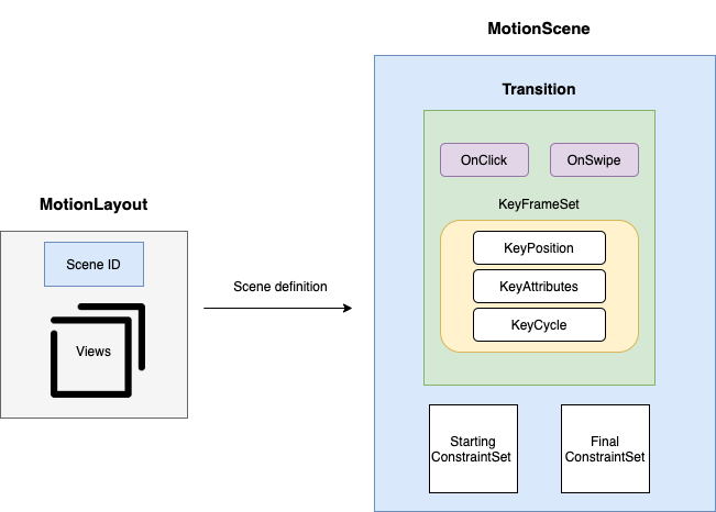
As you can see, MotionScene consists of two major blocks.
Transition block contains several pieces of information:
- The touch handler defines the way users will interact with the animation. The animation might be started with a click action or a user might progress animation with a swipe gesture.
- KeyFrameSet will enable us to fully customize animations. We will take a detailed look at keyframes later in this article.
- References to starting and final layout constraints.
Apart from that, we need to define a starting and final constraint set. We don’t need to define constraints for views that are still during the animation.
Now that we know the basics we can create our scene.
<?xml version="1.0" encoding="utf-8"?>
<MotionScene xmlns:motion="http://schemas.android.com/apk/res-auto"
xmlns:android="http://schemas.android.com/apk/res/android">
<Transition
motion:constraintSetEnd="@+id/end"
motion:constraintSetStart="@+id/start"
motion:duration="1000">
<OnSwipe
motion:dragDirection="dragRight"
motion:touchAnchorSide="right"
motion:touchAnchorId="@id/button"/>
</Transition>
<ConstraintSet android:id="@+id/start">
<Constraint
android:id="@+id/button"
android:layout_width="64dp"
android:layout_height="64dp"
android:layout_marginStart="8dp"
android:elevation="0dp"
motion:layout_constraintBottom_toBottomOf="parent"
motion:layout_constraintStart_toStartOf="parent"
motion:layout_constraintTop_toTopOf="parent"/>
<Constraint
android:id="@+id/imageView"
android:layout_width="128dp"
android:layout_height="128dp"
android:alpha="1"
android:scaleX="1"
android:scaleY="1"
motion:layout_constraintBottom_toBottomOf="parent"
motion:layout_constraintEnd_toEndOf="parent"
motion:layout_constraintStart_toStartOf="parent" />
</ConstraintSet>
<ConstraintSet android:id="@+id/end">
<Constraint
android:id="@+id/button"
android:layout_width="64dp"
android:layout_height="64dp"
android:layout_marginEnd="8dp"
android:elevation="20dp"
motion:layout_constraintTop_toTopOf="parent"
motion:layout_constraintBottom_toBottomOf="parent"
motion:layout_constraintEnd_toEndOf="parent"/>
<Constraint
android:id="@+id/imageView"
android:layout_width="256dp"
android:layout_height="256dp"
android:alpha="0.5"
motion:layout_constraintTop_toTopOf="parent"
motion:layout_constraintStart_toStartOf="parent"
motion:layout_constraintEnd_toEndOf="parent"/>
</ConstraintSet>
</MotionScene>
Let’s take a look at the more interesting parameters.
<Transition>
- motion:constraintSetStart — references starting layout constraints
- motion:constraintEndStart — references final layout constraints
- motion:duration — defines the duration of the animation. Note that it has no effect if the touch handler is defined as OnSwipe. In that case, the duration of the animation is defined by the velocity of the user's gesture and additional parameters that will be described later.
<OnSwipe>
- motion:dragDirection — determines the direction of the gesture that needs to be performed to progress the animation. If it’s equal to “dragRight,” a user needs to swipe from left to right to progress the animation. If a user swipes from right to left, the animation will be reversed.
- motion:touchRegionId — defines the view that needs to be dragged to progress the animation. If it’s not defined, a user might swipe anywhere within MotionLayout.
- motion:touchAnchorId — parameter might be a little confusing. We need to tell MotionLayout how much the animation should progress given the number of pixels a user dragged their finger on. So the library will determine how much a user's swipe gesture progresses the animation based on the distance between the starting and final position of the touchAnchor view.
- motion:touchAnchorSide — determines the side of the touchAnchor view.
- motion:dragScale — determines how much a swipe gesture will progress the animation. If dragScale is equal to 2 and a user's finger moves 2cm, the touch anchor view will move 4cm.
- motion:maxAcceleration — determines how fast the animation will snap to initial or final state once the user releases their finger.
- motion:maxVelocity — is similar to motion:maxAcceleration but determines the maximum velocity.
<ConstraintSet> — is a set of initial or final layout constraints. Each constraint defines attributes for a particular view. Take note that we can’t declare any view attribute as a part of a constraint. It should describe view position or one of the following:
- Alpha
- Visibility
- Elevation
- Rotation
- Translation
- Scale
If we need to animate a different view attribute, we should declare it as <CustomAttribute>. We will learn how to do this in the next section.
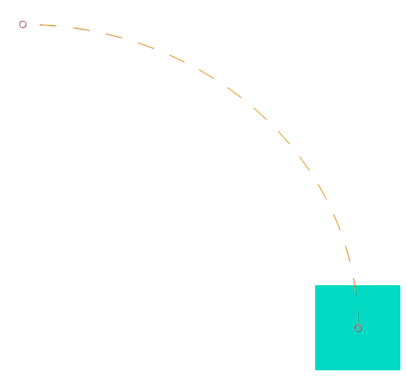
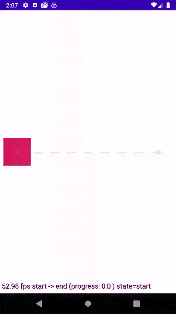
Let’s take a look at the animation we created.
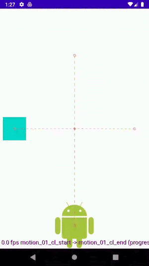
As you can probably remember we enabled debug overlay.
Thanks to this we can see text at the bottom describing the animation progress and animation frame rate. We can also see paths of our animated views.
The blue rectangle is the anchor view.
Custom Attributes for MotionLayout
MotionLayout also allows us to animate custom attributes. Let’s take a look at how to do this.
Start with implementing a custom view.
import android.content.Context
import android.graphics.Canvas
import android.graphics.Color
import android.graphics.Paint
import android.util.AttributeSet
import android.view.View
class HandleView(context: Context?, attrs: AttributeSet?) :
View(context, attrs) {
var radius: Float = 0f
private val paint by lazy {
Paint().apply {
color = Color.BLUE
}
}
override fun onDraw(canvas: Canvas?) {
super.onDraw(canvas)
val x = (width / 2).toFloat()
val y = (height / 2).toFloat()
canvas?.drawCircle(x, y, radius * width / 2, paint)
}
}
This custom view paints a blue circle with a radius dependent on the radius variable. We will modify this variable to animate circle size.
Our layout will be very basic once again.
fragment_other_motion_layout.xml
<?xml version="1.0" encoding="utf-8"?>
<androidx.constraintlayout.motion.widget.MotionLayout xmlns:android="http://schemas.android.com/apk/res/android"
xmlns:app="http://schemas.android.com/apk/res-auto"
xmlns:tools="http://schemas.android.com/tools"
android:id="@+id/motionLayout"
android:layout_width="match_parent"
android:layout_height="match_parent"
app:layoutDescription="@xml/scene_02"
tools:showPaths="true">
<com.nomtek.animations.demo.views.HandleView
android:id="@+id/button"
android:layout_width="64dp"
android:layout_height="64dp"
android:background="@color/colorAccent"
android:text="@string/button" />
</androidx.constraintlayout.motion.widget.MotionLayout>
HandleView is the only view in our MotionLayout. Now let’s define MotionScene.
scene_02.xml
<?xml version="1.0" encoding="utf-8"?>
<MotionScene xmlns:android="http://schemas.android.com/apk/res/android"
xmlns:motion="http://schemas.android.com/apk/res-auto">
<Transition
motion:constraintSetEnd="@+id/end"
motion:constraintSetStart="@+id/start">
<OnSwipe
motion:dragDirection="dragRight"
motion:touchAnchorId="@+id/button"
motion:touchAnchorSide="right"
motion:touchRegionId="@+id/button" />
</Transition>
<ConstraintSet android:id="@+id/start">
<Constraint
android:id="@+id/button"
android:layout_width="64dp"
android:layout_height="64dp"
android:layout_marginStart="8dp"
motion:layout_constraintBottom_toBottomOf="parent"
motion:layout_constraintStart_toStartOf="parent"
motion:layout_constraintTop_toTopOf="parent">
<CustomAttribute
motion:attributeName="backgroundColor"
motion:customColorValue="#D81B60" />
<CustomAttribute
motion:attributeName="radius"
motion:customFloatValue="0" />
</Constraint>
</ConstraintSet>
<ConstraintSet android:id="@+id/end">
<Constraint
android:id="@+id/button"
android:layout_width="64dp"
android:layout_height="64dp"
android:layout_marginEnd="8dp"
motion:layout_constraintBottom_toBottomOf="parent"
motion:layout_constraintEnd_toEndOf="parent"
motion:layout_constraintTop_toTopOf="parent">
<CustomAttribute
motion:attributeName="backgroundColor"
motion:customColorValue="#ECAB70" />
<CustomAttribute
motion:attributeName="radius"
motion:customFloatValue="1" />
</Constraint>
</ConstraintSet>
</MotionScene>
This scene is very similar to the last one. We’ve added <CustomAttribute> to our constraints. Circle radius will be changing its value from 0 to 1 while the animation progresses.
To create a custom attribute, you need to define a variable with public getter and setter in a custom view and then pass its name as motion:attributeName. <CustomAttribute> can be also used for already defined view properties like backgroundColor.
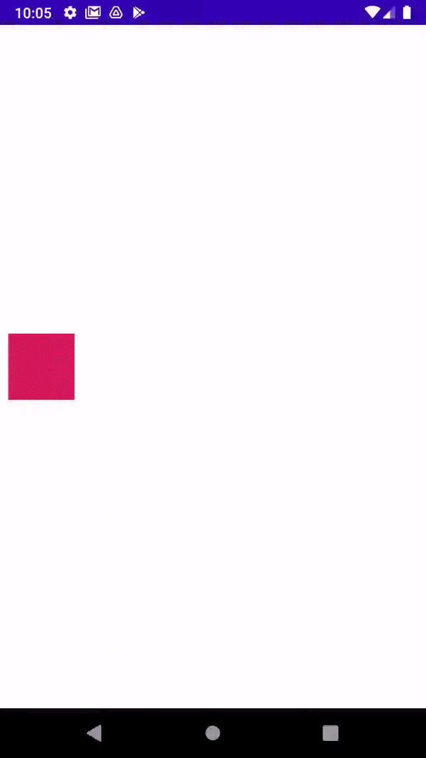
Thanks to custom attributes, circle size and background color are animated.
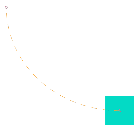
Arc Motion
Material design guidelines often recommend using arc motion in animations as it’s more natural. How can we achieve it with MotionLayout?
One way would be to use KeyFrameSet. We will learn about this option later. The second way is to use the pathMotionArc parameter.
Let’s examine an example.
scene_02.xml
<?xml version="1.0" encoding="utf-8"?>
<MotionScene
xmlns:android="http://schemas.android.com/apk/res/android"
xmlns:motion="http://schemas.android.com/apk/res-auto">
<Transition
motion:constraintSetEnd="@+id/end"
motion:constraintSetStart="@+id/start"
motion:duration="500">
<OnClick
motion:clickAction="toggle"
motion:targetId="@+id/button"/>
</Transition>
<ConstraintSet android:id="@+id/start">
<Constraint
android:id="@+id/button"
android:layout_width="80dp"
android:layout_height="80dp"
android:layout_marginBottom="8dp"
android:layout_marginEnd="8dp"
motion:pathMotionArc="startVertical"
motion:layout_constraintBottom_toBottomOf="parent"
motion:layout_constraintEnd_toEndOf="parent">
</Constraint>
</ConstraintSet>
<ConstraintSet android:id="@+id/end">
<Constraint
android:id="@+id/button"
android:layout_width="80dp"
android:layout_height="80dp"
android:layout_marginBottom="8dp"
android:layout_marginStart="8dp"
motion:layout_constraintStart_toStartOf="parent"
motion:layout_constraintTop_toTopOf="parent"
motion:layout_constraintBottom_toBottomOf="parent">
</Constraint>
</ConstraintSet>
</MotionScene>
As you can see we’ve added motion:pathMotionArc="startVertical" to the starting constraint. Here is the result.
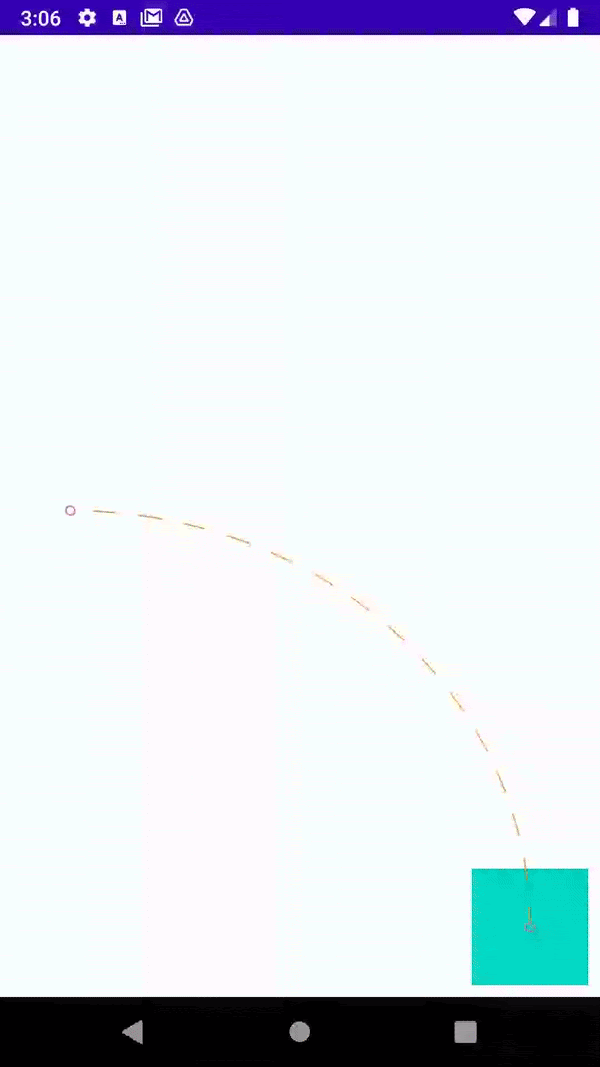
Here are motion:pathMotionArc possible values: “flip”, “none”, “startVertical”, “startHorizontal”.
KeyFrameSet
The last piece of the MotionLayout puzzle is the key frameset. It gives more control over the animation’s motion. We will now describe the most important keyframes in detail.
KeyPosition specifies view position during the motion sequence. Here are the most important attributes:
- motion:motionTarget — defines view whose position is changed.
- motion:transitionEasing — determines what kind of easing curve will be used. Possible values are “accelerate” | “decelerate” | “linear.”
- motion:curveFit — describes the interpolation curve. Possible values are “spline” and “linear.”
- motion:percentX, motion:percentY — specify view position.
- motion:framePosition determines when the position should be reached. It’s an integer in range [0,100]. For example value 50 would mean that position will be reached in the middle of the animation.
- motion:keyPositionType — determines how exactly motion:motionPercentX and motion:percentY will affect view’s position. Possible values are:
- deltaRelative — means that the values you provided will be relative to the view's animation distance on a given axis. For example, if during the animation a view moves down 100 pixels and motionPercentX is equal to -50% then it means that in the initial stage of the animation your view will move up 50 pixels and then it will move down 150 pixels to its final destination.
- parentRelative — is similar to deltaRelative but the values will be relative to the parent size.
- pathRelative — behaves similarly to previous attributes but changes the coordinates system. In our new coordinate system X-axis is the direction of the target view. Y-axis is perpendicular to X-axis. Thanks to this you can move your object up and down even if the starting position’s y coordinate is the same as the final position’s y coordinate. That wasn’t the case for deltaRelative.
Note that the attributes motionTarget, transitionEasing, curveFit, and framePosition are common for all keyframe types.
Let’s define the key frameset with a single KeyPosition and add it to our previous scene.
<KeyFrameSet>
<KeyPosition
motion:keyPositionType="parentRelative"
motion:percentY="0.25"
motion:framePosition="50"
motion:motionTarget="@id/button" />
</KeyFrameSet>
As you can see we achieved a nice-looking arc motion. Our animated view reaches 25% of parent height in the middle of the animation.
The second keyframe we will talk about is KeyAttribute. KeyAttribute works in a similar way to KeyPosition but instead of modifying the target view’s position, it changes some of its attributes.
Attributes that we can modify are the following:
- android:visibility
- android:alpha
- android:elevation
- android:rotation
- android:rotationX
- android:rotationY
- transitionPathRotate — rotates view relative to its path
- android:scaleX
- android:scaleY
- android:translationX
- android:translationY
- android:translationZ
Note that KeyAttribute might be used as well with custom attributes.
Let’s define our key frameset as a single KeyAttribute. Apart from attributes that we want to change we need to specify motionTarget and framePosition.
<KeyFrameSet>
<KeyAttribute
motion:motionTarget="@id/button"
motion:framePosition="80"
android:alpha="0.5"
android:rotationX="45"
android:scaleX="2"
android:scaleY="2"
android:translationZ="20dp"/>
</KeyFrameSet>
As you can see we are modifying the view’s opacity, rotation, scale, and translation on Z-axis. Let’s check out the result.
So far we have talked about the two simplest key frames. The other really interesting keyframe is KeyCycle.
Keycycles aim to solve one issue — what if we would like to repeat a motion many times during the animation? It would be very difficult with our current toolset. We would have to define many KeyPosition frames to achieve it. Keycycle frames let us define view parameter change that will be repeated in a cycle.
Let’s examine what attributes can we define for KeyCycle frames:
- Standard view attributes like android:alpha, android:rotation.... See the list compiled for KeyAttribute earlier in this article.
- Shared attributes for all key frames that we described in the KeyPosition section.
- waveShape determines the function that will be used to generate repeating motion. Possible values are: “sin,” “cos,” “triangle,” “square,” “triangle,” “sawtooth,” “reverseSawtooth,” “cos,” “bounce.” The value of your attribute will be multiplied by adequate values returned by the chosen function.
- waveOffset — describes offset applied to your attribute value. So the actual value for your attribute at time t is equal to the waveFunction(t)*initialAttributeValue + waveOffset.
- wavePeriod — determines the number of waves (cycles) performed during the animation duration.
Before we start experimenting with the code let’s get familiar with a very useful tool from Google — CycleEditor. Cycle editor will let us examine in detail how our designed cycles will behave.
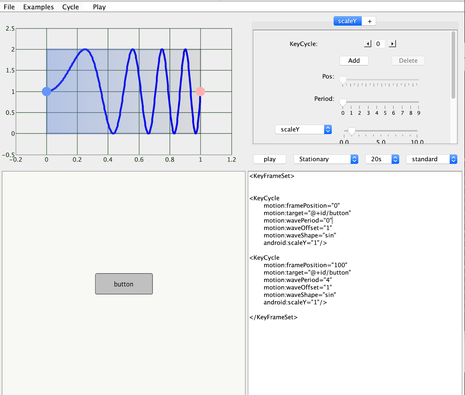
This tool is quite simple to use. We can configure our cycles in the top right panel. We can add, delete key cycles, and configure parameters: framePosition, wavePeriod, waveOffset, waveShape. We can also start and pause the animation.
In the bottom left panel, there’s a button that will let us preview the animation. In the right bottom panel, there’s the resulting xml file.
The left top panel is the most interesting. We can see the resulting key cycle function describing the value of the specified attribute during the animation progress.
Let’s start coding! First we will define layout xml.
fragment_other_motion_layout.xml
<?xml version="1.0" encoding="utf-8"?>
<androidx.constraintlayout.motion.widget.MotionLayout xmlns:android="http://schemas.android.com/apk/res/android"
xmlns:app="http://schemas.android.com/apk/res-auto"
xmlns:tools="http://schemas.android.com/tools"
android:id="@+id/motionLayout"
android:layout_width="match_parent"
android:layout_height="match_parent"
app:layoutDescription="@xml/scene_02"
tools:showPaths="true">
<ImageView
android:id="@+id/droidImageView"
android:layout_width="wrap_content"
android:layout_height="wrap_content"
android:layout_marginTop="16dp"
app:layout_constraintTop_toTopOf="parent"
app:layout_constraintStart_toStartOf="parent"
app:layout_constraintEnd_toEndOf="parent"
android:src="@drawable/ic_droid"/>
</androidx.constraintlayout.motion.widget.MotionLayout>
Now let’s define MotionScene.
scene_02.xml
<?xml version="1.0" encoding="utf-8"?>
<MotionScene xmlns:android="http://schemas.android.com/apk/res/android"
xmlns:motion="http://schemas.android.com/apk/res-auto">
<Transition
motion:constraintSetEnd="@+id/end"
motion:constraintSetStart="@+id/start"
motion:duration="6000">
<OnClick
motion:targetId="@+id/droidImageView"
motion:clickAction="toggle"/>
<KeyFrameSet>
<KeyCycle
motion:framePosition="0"
motion:motionTarget="@+id/droidImageView"
motion:wavePeriod="0 "
motion:waveOffset="1"
motion:waveShape="sin"
android:scaleX="1"
android:scaleY="1"/>
<KeyCycle
motion:framePosition="100"
motion:motionTarget="@+id/droidImageView"
motion:wavePeriod="4"
motion:waveOffset="1"
motion:waveShape="sin"
android:scaleX="1"
android:scaleY="1"/>
</KeyFrameSet>
</Transition>
<ConstraintSet android:id="@+id/start">
<Constraint
android:id="@+id/droidImageView"
android:layout_width="100dp"
android:layout_height="100dp"
android:rotation="0"
motion:layout_constraintStart_toStartOf="parent"
motion:layout_constraintEnd_toEndOf="parent"
motion:layout_constraintTop_toTopOf="parent"
motion:layout_constraintBottom_toBottomOf="parent"
android:alpha="1"/>
</ConstraintSet>
<ConstraintSet android:id="@+id/end">
<Constraint
android:id="@+id/droidImageView"
android:layout_width="100dp"
android:layout_height="100dp"
motion:layout_constraintTop_toTopOf="parent"
motion:layout_constraintEnd_toEndOf="parent"
motion:layout_constraintStart_toStartOf="parent"
motion:layout_constraintBottom_toBottomOf="parent"
android:rotation="90"
android:alpha="0.5"/>
</ConstraintSet>
</MotionScene>
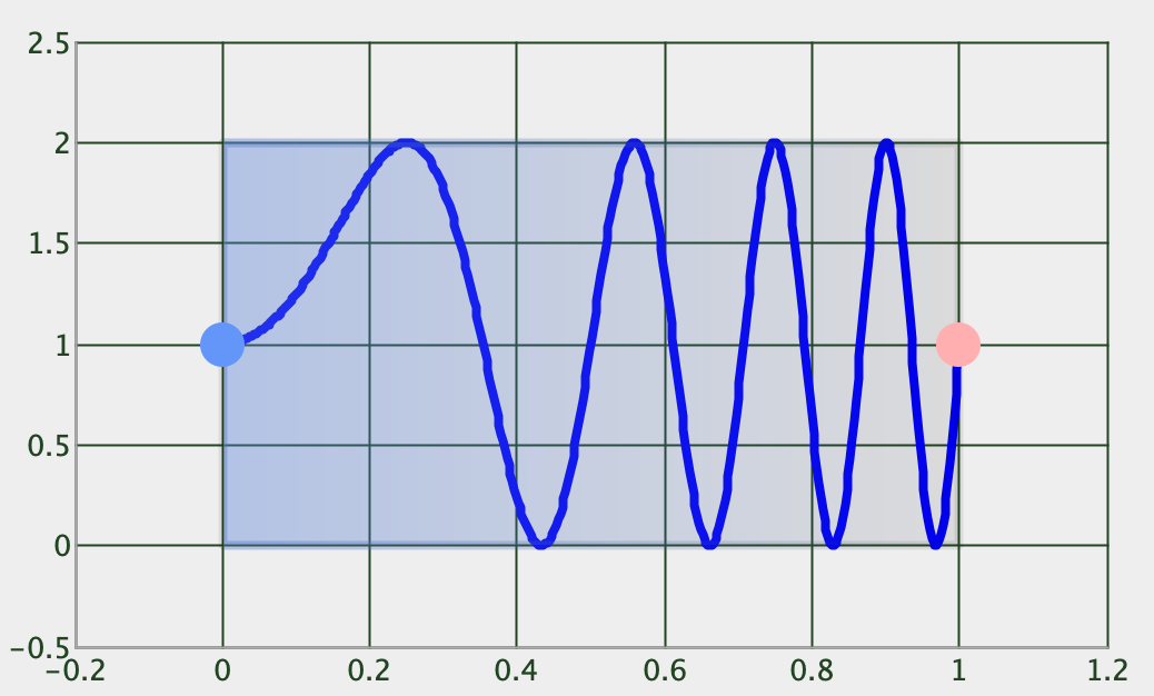
We’ve defined two key cycles. One at the start of the animation and the second one at the end. Let’s see the result.
As we can see in the gif above the image is enlarged and shrank 4 times. The animation is slower at the beginning and faster at the end. It’s caused by the KeyCycle at 0 frame position.
Let’s confirm this observation using the cycle editor tool.
Indeed the first cycle is much wider than the rest.
We have 4 waves because we defined the wavePeriod as equal to 4. Also note that thanks to waveShape our wave is similar to sinus function. Its values are offset by 1.
You can combine many key cycles to get really interesting results. We recommend using the mentioned beforehand key cycle editor as it makes the job much easier.
The last key frame that we would like to mention is KeyTimeCycle. It behaves similarly to KeyCycle. The difference is that it runs indefinitely and it is independent of the animation itself. The key attribute is wavePeriod. It describes the number of cycles per second.
<KeyFrameSet>
<KeyTimeCycle
motion:motionTarget="@+id/droidImageView"
motion:wavePeriod="1"
motion:waveOffset="1"
motion:waveShape="sin"
android:scaleX="1"
android:scaleY="1"/>
</KeyFrameSet>
The KeyTimeCycle’s animation runs indefinitely in the loop.
We hope that you found MotionLayout interesting. We love using it in our projects as this relatively simple tool lets us build complex animations.
The good news is that Google still actively works on enriching the capabilities of MotionLayout. The latest release added support for rotational OnSwipe and view transitions. We are very excited to try the new features.
At nomtek, we love exploring use cases for MotionLayout. I hope you too will find a lot of use for MotionLayout in your future projects. Feel free to share your thoughts in the comment section!

Related articles
Supporting companies in becoming category leaders. We deliver full-cycle solutions for businesses of all sizes.


