Create a Sleek UI in Flutter — Wolt App Case Study
written by:

X min read
21.6.2020
App Bar Buttons & Menu Let’s warm up with something that seems simple - app bar buttons. The landscape requires strategies that combine adaptability, risk management, and continuous improvement. By applying structured yet flexible approaches, organizations can strengthen resilience, optimize efficiency, and deliver solutions that meet both business goals and user needs.

App Bar Buttons & Menu
Let’s warm up with something that seems simple - app bar buttons. There are two of them - one is used to navigate back, and the other is showing a menu with two items. My first idea was to use IconButton composed with Container that has circle-shaped decoration:
class AppBarButton extends StatelessWidget {
final IconData icon;
final VoidCallback onPressed;
const AppBarButton({Key key, this.icon, this.onPressed}) : super(key: key);
@override
Widget build(BuildContext context) {
return Container(
decoration: BoxDecoration(shape: BoxShape.circle, color: Colors.grey[300]),
child: IconButton(
icon: Icon(icon),
onPressed: onPressed,
),
);
}
}
When we put those widgets in an AppBar:
SliverAppBar(
leading: AppBarButton(
icon: Icons.keyboard_backspace,
onPressed: () => Navigator.pop(context),
),
actions: [
AppBarButton(
icon: Icons.more_horiz,
onPressed: () { /* TODO */ },
),
],
The result is already quite similar to what we have in the original application:
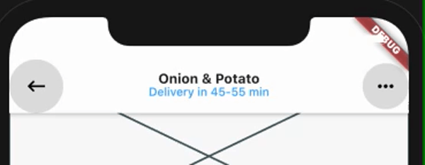
Our first implementation has no padding and buttons are too big. When we press the button it shows a grey highlight followed by an animated, darker splash instead of opacity change.
Let’s try to implement those missing features.
Size and Layout
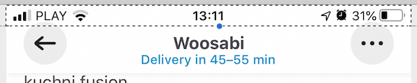
On the iPhone 8, original buttons have a size of 40x40 points, 16 points margin to the screen edge and 8 points bottom offset. Given that app bar has a height of 44 points on this iPhone it would mean that those buttons have to overlay status bar (the one with signal strength, clock and battery status) and indeed they are:
We can apply those constraints by wrapping our button widgets in Padding and Align.
return Padding(
padding: EdgeInsets.fromLTRB(
position == AppBarPosition.leading ? 16 : 0, 0,
position == AppBarPosition.trailing ? 16 : 0, 8),
child: Align(
alignment: Alignment.topCenter,
child: Container(
width: 40,
height: 40,
(...)
One difference is that the bottom offset is bigger in our implementation and we don’t even overflow status bar. The reason is that the height of our app bar is calculated based on the const double kToolbarHeight = 56.0; constant from the Flutter development framework. There is no explicit way to set app bar height, eg. by constructor parameter, and the class responsible for the app bar layout, which uses this constant, is private (_SliverAppBarDelegate).
This prevents us from using inheritance to override the code responsible for height computation. This delegate is, again, not exposed by the app bar (SliverAppBar), so even if we end up creating our own version, we won’t be able to use it unless we also extend SliverAppBar and override build method from its state.
Since Flutter is open source this could be done in a few minutes, by copy-paste original implementation and tweaking those details, but it’s far from feasible solution as we would have to maintain our version and keep it in sync with improvements made by the Flutter team to the original classes.
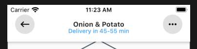
It’s worth to take a note, that kToolbarHeight is also used to constraint the width of the leading widget (back button in our case), forcing it to be a square. This is how our app bar looks like with margins increased to 25 points. Notice the shrunken leading button, while trailing is spaced from the screen edge as expected. This limitation has no effect in our case, as designed margin and button size is exactly matching available space.
Highlight Behavior
In the Wolt app when the button is highlighted it changes the opacity of the icon. There is no highlight colour change or splash animation. We can re-create such behaviour by wrapping button in the Opacity widget. To track highlight status we have to introduce an internal state, represented by the _isHighlighted boolean property. That means we have to refactor our widget from stateless to stateful:
enum AppBarPosition {
leading,
trailing,
}
class AppBarButton extends StatefulWidget {
final IconData icon;
final VoidCallback onPressed;
final AppBarPosition position;
const AppBarButton({Key key, this.icon, this.onPressed, this.position}) : super(key: key);
@override
_AppBarButtonState createState() => _AppBarButtonState();
}
class _AppBarButtonState extends State {
bool _isHighlighted = false;
@override
Widget build(BuildContext context) {
return Padding(
padding: EdgeInsets.fromLTRB(widget.position == AppBarPosition.leading ? 16 : 0, 0,
widget.position == AppBarPosition.trailing ? 16 : 0, 8),
child: Align(
alignment: Alignment.topCenter,
child: Container(
width: 40,
height: 40,
decoration: BoxDecoration(shape: BoxShape.circle, color: Colors.grey[300]),
child: Opacity(
opacity: _isHighlighted ? 0.3 : 1.0,
child: IconButton(
icon: Icon(
widget.icon,
color: Colors.black,
),
onPressed: widget.onPressed,
),
),
),
),
);
}
}
Unfortunately, IconButton we are using is not exposing onHighlightChanged callback — only onPressed, which is not enough for our needs. We have to refactor our code to use more generic button class, like RawMaterialButton where we have more control over callbacks and visual settings.
child: RawMaterialButton(
highlightColor: Colors.transparent,
splashColor: Colors.transparent,
onHighlightChanged: (isHighlighted) => setState(() {
_isHighlighted = isHighlighted;
}),
child: Icon(
widget.icon,
color: Colors.black,
),
onPressed: widget.onPressed,
),
Showing the Menu
When the user presses menu button two things happen — the menu is shown and the button icon changes from three dots to close cross. We are going to track the current state in the boolean property _isMenuShown in the State of the screen-route. Updated menu button:
AppBarButton(
icon: _isMenuShown ? Icons.close : Icons.more_horiz,
position: AppBarPosition.trailing,
onPressed: () {
Navigator.push(context, AppBarMenu())
.then((_) => setState(() => _isMenuShown = false));
setState(() => _isMenuShown = true);
},
),
We will build AppBarMenu class that extends PopupRoute, as it gives us more control over UI of the menu than PopupMenuButton from the Flutter framework. On button press, Navigator widget is tasked to push our Route to the stack. Push method returns a future which completes after this route is dismissed — that’s why we set _isMenuShown to false in the then callback.
Menu Look & Feel
Our final task is to build a menu that will be displayed. It’s pretty straightforward — a list with two items, the less obvious parts maybe how to place it on the screen, and how to achieve the shape of a rectangle with rounded corners and triangle indicator on top. We are going to use ClipPath widget with a custom clipper to build the desired shape.
An alternative solution would be to compose ClipRRect (RRect stands for rounded rectangle) with an Image widget for the top triangle. Yet another idea is to have a whole background as a nine-patch image, and there are for sure a few more feasible options to achieve the desired UI. Due to Flutter’s widget-oriented architecture, there are often multiple ways how can we compose existing primitives into more complex structures — like this fancy-shaped menu. You can preview updated buttons and the menu on the gif below:
.gif)
Choose Flutter for Familiar UI & UX on iOS and Android
Flutter allowed us to recreate, very closely, UI and UX of Wolt’s piece of the interface. We were able to achieve the compelling look & feel quickly by composing native widgets, and even if there are certain limitations, due to open-source nature of the Flutter framework, achieving pixel-perfect quality is possible when needed. Flutter's features and ease of development made it a popular tech stack choice among many companies.

Related articles
Supporting companies in becoming category leaders. We deliver full-cycle solutions for businesses of all sizes.


.png)
